
Understanding Trade Graphs and Their Uses
📊 Discover how trade graphs map relationships between countries, guide economic policies, and impact Pakistan’s trade with clear examples and data insights.
Edited By
Thomas Reed
Navigating the financial markets without a proper grasp of trade charts is like trying to sail without a compass. Especially in Pakistan’s growing market, where understanding price movements can mean the difference between profit and loss, knowing how to read and interpret these charts is essential.
Trade charts are more than just lines and shapes; they tell the story of investor behavior and market sentiment. Whether you are a beginner trader in Karachi or a seasoned investor in Lahore, getting comfortable with these charts will help you make smarter decisions.
This guide will cover the core elements of trade charts, explain different types of charts used in Pakistan’s markets, and show how to spot patterns and use indicators that can guide your trading strategy effectively.
"Charts don't predict the future, but they show the footprints left behind, guiding you to where the market might head next."
By the end, you'll feel equipped with practical know-how to analyze charts like a pro, helping you avoid common pitfalls and seize opportunities the right way.
Understanding trade charts is like having a roadmap when you're navigating the busy streets of Karachi or Islamabad. These charts help traders keep an eye on the twists and turns of the market, giving them a clearer picture of where prices are heading. For traders in Pakistan, where the market can be influenced by local economic and political shifts, grasping the basics of trade charts is a must.
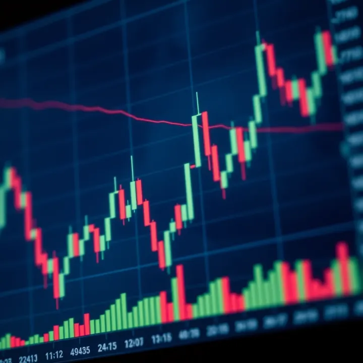
Simply put, a trade chart is a visual tool that displays the price movements of financial assets such as stocks, commodities, or currencies over time. Imagine it as a snapshot capturing the heartbeat of the market. The main goal is to provide traders with real-time and historical data in an easy-to-understand format, helping them make informed decisions without relying only on guesswork.
Trade charts typically plot price on the vertical axis against time on the horizontal axis. This layout shows how prices fluctuate throughout specific intervals — for example, minutes, hours, days, or even weeks. Some charts also show the trading volume, which tells you how many shares or contracts changed hands. This is especially useful when trying to figure out if a price move is backed by strong trading activity or just a blip.
Charts transform raw numbers into visual stories. They allow traders to spot trends, reversals, and key price levels that are not obvious from a list of numbers alone. For instance, if a trader sees a consistent uptrend forming on the chart of a Pakistan Stock Exchange-listed company, they might decide it’s a good time to buy before prices jump higher. Without charts, these opportunities can slip by unnoticed.
In Pakistan, factors like political developments, currency fluctuations, and commodity prices often create sudden market swings. Trade charts help by offering a clear, consolidated view of price action during these volatile times. Such visibility assists traders in timing their entries and exits more wisely, reducing the chances of emotional decision-making. Plus, with the growing availability of platforms like PSX’s official charting tools and MetaTrader, local traders are well-equipped with resources tailored to their needs.
Tip: Regularly following trade charts keeps you grounded during wild market phases — think of it as your trading compass.
In short, trade charts are the backbone of modern trading, turning complex market data into actionable insights. For anyone diving into Pakistan’s financial markets, a solid grasp of these charts is the first step toward smarter trading and better results.
Trade charts come in various shapes and sizes, each offering a different perspective on market data. Familiarity with these types is important because it lets traders pick the best tool for their specific trading style or analysis needs. In Pakistan’s bustling trading environment, knowing which chart suits your purpose can save time and improve your decisions.
Line charts are the most straightforward kind of trade chart. They connect closing prices over a set period with a continuous line, giving a simple overview of price movement.
Focuses on closing prices only.
Creates a smooth, clear visual trend over time.
Easy to interpret, even for beginners.
For example, if you’re tracking the Pakistan Stock Exchange (PSX) performance over a month, a line chart quickly shows you whether the general price trend is up, down, or sideways without distractions from intra-day price swings.
Line charts are best when you want a clear snapshot of overall trend without needing detailed price data, such as highs or lows. They work well for long-term investment analysis or when monitoring general market direction during volatile periods.
Use them to get a clean look at how a stock or index is moving over weeks or months, helping to avoid overcomplicating analysis with short-term price noise.
Bar charts add a bit more nuance by showing opening, closing, high, and low prices for each time interval.
A vertical line represents the price range—from the lowest to highest.
Small horizontal ticks on the sides show opening (left) and closing (right) prices.
This structure gives an immediate sense of daily price volatility and where prices start and end within the session. For traders keeping an eye on the PSX, bar charts reveal how aggressively prices moved during the day, rather than just the final tally.
Because bar charts show four price points, they provide richer information about intraday price behavior and momentum shifts. Traders can spot patterns like price rejection or strength at certain levels.
For instance, a long upper wick (the high point on the bar) might imply sellers pushed prices down from intraday highs, a helpful clue for timing entries or exits.
Candlestick charts pack similar info to bar charts but present it visually in a more digestible way. They use colors and shapes to represent price data, making them popular worldwide.
The 'body' shows the range between opening and closing prices.
Colored bodies indicate direction: green or white for up-days, red or black for down-days.
Thin lines above or below the body (wicks or shadows) mark the day's highs and lows.
This format immediately communicates not just price movement, but also market sentiment—whether buyers or sellers dominated.
Their visual clarity helps traders quickly catch shifts in momentum or reversal signals. In markets such as Pakistan’s, where timely decisions are essential amid fluctuating conditions, candlesticks reveal patterns like "doji" or "hammer" that hint at potential turning points.
For example, spotting a hammer candlestick after a downtrend on a PSX stock chart may suggest buyers are stepping in, offering a chance to buy low before prices bounce.
Picking the right type of trade chart depends on your trading goals and comfort level with data complexity. Beginners might start simple with line charts, then graduate to bar or candlestick charts as they seek deeper insights. Whatever you choose, consistently practicing chart reading helps build intuition in Pakistan's dynamic market.
Trade charts can look like a mess of lines and colors if you’re not sure what to focus on. The key components—the backbone of any good chart—help traders see the story behind those numbers clearly. For anyone trading in Pakistan’s markets, understanding these elements is not just neat to know but essential to make sound decisions.
At the heart of every trade chart are the price axis, time axis, volume data, and the ever-important trends and trendlines. These components together give you a clearer picture of how prices have moved over time, how much is being traded, and where the market might head next. Ignoring these building blocks is like trying to navigate Karachi’s busy streets blindfolded—possible but bound to get you lost.
Let's break down these pillars and how they each play a part in decoding the market action efficiently.
The first step is to get comfortable with reading the price axis and time axis. The price axis usually runs vertically along the side of the chart and shows the price levels of the asset. For instance, on a chart of Pakistan Stock Exchange’s KSE-100 index, this axis might range from 40,000 points up to 50,000 points depending on market movement. The time axis stretches horizontally across the bottom and marks the time intervals—these could be minutes, hours, days, or even months, depending on your chart settings.
Reading these axes correctly lets you pinpoint exactly when and at what price level certain moves happened. If you notice a sharp decline in a stock’s price at around 2 PM on the trading day, you can then look into what news or events might have triggered it.
These two axes aren’t just numbers; they anchor the whole chart. Without the time axis, you wouldn’t know the sequence of price changes, and without the price axis, the data wouldn’t mean anything in terms of value. For example, a spike in the price axis without knowing its time frame tells you little about the market tempo or volatility.
For Pakistani traders, integrating this knowledge means better timing of entry and exit points. Say you spot a stock that consistently hits support at 45,000 points around midday; this insight helps you predict potential bounce backs or breakdowns.
Volume bars at the bottom of most charts show how many shares or contracts traded during a specific time frame. Higher volumes often hint at stronger conviction behind a move. For example, if a volume spike accompanies a price rise in a textile company listed on the PSX, it suggests buying interest rather than a random price jump.
Low volume periods might indicate indecision or lack of interest, which often precedes major price movements as traders await fresh triggers. Ignoring volume can be like sailing without a compass—you might see waves of price change but miss the underlying currents.
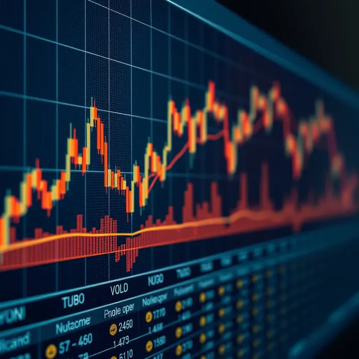
Volume can confirm trends or warn of their weakness. A rising price on increasing volume tends to confirm buyers are pushing the stock up. Conversely, a price rise on low volume might be a sign of a weak rally or a fleeting spike.
In Pakistan’s volatile markets, volume analysis is especially valuable. For instance, during election periods or economic reports' release, volume can surge, indicating heightened market activity and potential opportunities or risks.
"Volume doesn't lie." It complements price moves by showing how many are backing that price direction, which is a crucial piece of the puzzle.
Trends describe the general direction prices are moving — up, down, or sideways. Spotting these trends early helps traders align their trades with the market’s momentum. If you see a consistent series of higher highs and higher lows, you’re likely on an uptrend; if it’s lower highs and lower lows, downtrend territory.
Pakistan’s stock market often demonstrates sharp trends during favorable economic announcements or international market influences. Recognizing these early can save you from jumping into a losing trade or missing out on profits.
Trendlines are straight lines drawn to connect either highs in a downtrend or lows in an uptrend. They act as visual guides to support and resistance zones. For example, drawing a trendline under the lows of Lucky Cement’s stock price for several weeks might help you anticipate when a price dip could bounce back.
Using these lines alongside price action gives traders a practical way to forecast potential reversal points or continuation of trends. Without trendlines, identifying these zones might feel like guessing in the dark.
Understanding how these components work together is the nuts and bolts of chart reading. They provide a framework around which all other analyses—patterns, indicators, signals—are built. Whether you’re a rookie trader in Lahore or a seasoned investor in Islamabad, mastering these basics gives you the edge for better trading choices.
Recognizing basic chart patterns is a game-changer for traders. These patterns act like road signs, giving clues about where prices might head next. For traders in Pakistan, who often deal with market volatility driven by economic and political shifts, spotting these patterns can help in making more informed, timely decisions, rather than gambling blindly.
Support and resistance are like invisible floors and ceilings on a chart. Support is a price level where a downtrend tends to pause due to a concentration of buying interest, while resistance is where an uptrend gets halted as selling pressure mounts.
To identify these levels, look for price points where the market has bounced multiple times. For example, if the stock price of Pakistan State Oil continuously drops to around PKR 75 and then bounces back, that’s a support level. Conversely, if it hits PKR 90 several times but doesn't cross it, that spot acts as resistance.
Spotting these zones isn’t just guesswork. They often align with prior highs and lows, round numbers (like PKR 100), and even psychological barriers where traders collectively take action.
Using support and resistance strategically helps traders decide when to enter or exit trades. You might buy near a solid support level because the chance of prices falling further is less, and sell near resistance where the price might reverse.
For instance, if you notice the KSE-100 index hitting a resistance line repeatedly but failing to break through, a cautious trader might take profits or tighten stop-losses around that price to protect gains.
Support and resistance also help in setting stop-loss orders sensibly, below support for buys and above resistance for sells, reducing unnecessary losses.
Remember, these levels aren’t precise numbers but zones, so allow some wiggle room to avoid premature decisions.
Patterns like Head and Shoulders or Double Tops/Bottoms are some of the most reliable signals for potential trend reversals.
Head and Shoulders resembles a baseline with three peaks: the middle one (head) is the highest, flanked by two lower peaks (shoulders). A classic example is when the oil commodity prices chart shows a left shoulder forming around $65, a head climbing to $72, and a right shoulder back near $65.
Double Tops looks like two peaks at roughly the same level, signaling that upward momentum is fading. On the flip side, a Double Bottom signals a potential trend reversal upwards, like two low points at similar prices.
Spotting these patterns early provides a window for timely trades, but always confirm with volume and other indicators to avoid traps.
These patterns generally hint at strong shifts in market sentiment. For example, the formation of a Head and Shoulders pattern often precedes a bearish reversal, meaning prices are likely to fall after the right shoulder completes.
In the Pakistani market, say a textile stock forming a Double Top near PKR 120 then breaks below the neckline (support level), it could signal a downturn. Traders anticipating this might sell early or short sell to capitalize.
Likewise, a Double Bottom suggests buyers stepping in, potentially pushing prices up. Watching for increased volume during the bounce solidifies the signal.
Patterns should never be traded in isolation. Combine them with other tools like Moving Averages or RSI to confirm the move and avoid false alarms.
Understanding these foundational chart patterns arms traders with a practical toolkit to read market movements better, manage risk, and seize trading opportunities across Pakistan’s dynamic financial markets.
Technical indicators add an extra layer to trade charts by helping traders analyze price movements beyond what the raw data shows. In the Pakistani market or anywhere else, these tools filter noise and highlight trends or reversals that might not be obvious at first glance. Indicators like moving averages, RSI, and MACD aren’t just numbers on a screen—they’re signals telling you when to hold tight or cut loose. Using them wisely can give you a leg up in spotting opportunities, but it’s important to understand how they work before putting all your trust in them.
A simple moving average (SMA) calculates the average price over a set number of periods, giving equal weight to each point. For example, if you’re looking at a 20-day SMA, it adds up the last 20 closing prices and finds the average. Easy to follow, but it reacts slower to recent price changes. On the other hand, an exponential moving average (EMA) puts more emphasis on recent prices, so it’s quicker to signal changes in trend. For Pakistani traders watching volatile markets like the KSE-100, EMA can be more responsive to sudden shifts, while SMA helps smooth out the choppiness.
Traders use moving averages mainly to identify trend direction and smooth out noise. When the price stays above a moving average, it usually means an uptrend; below it indicates a downtrend. Crossovers are another common tactic: if a short-term moving average crosses above a long-term one, it can signal a buying opportunity. For instance, a 50-day SMA crossing above the 200-day SMA is often called a "golden cross"—a sign some Pakistani traders watch closely. Conversely, a downward crossover might suggest it's time to sell.
RSI measures the speed and change of price movements on a scale from 0 to 100. It helps identify momentum by comparing gains to losses over a specified period, typically 14 days. A high RSI means the asset has been gaining strength, and a low RSI signals weakness. Unlike basic price trends, RSI zeroes in on how strong or weak the price action really is, offering clues about potential reversals before they happen.
An RSI above 70 commonly indicates that an asset is overbought, meaning the price might be due for a pullback, while an RSI below 30 suggests it’s oversold and could bounce back. Think of it like a rubber band stretched too far – eventually, it snaps back. For Pakistan’s equity or forex traders, using RSI can prevent jumping into a trade when prices are already stretched. It's common to combine RSI signals with other tools for confirmation to avoid getting trapped in false alarms.
The Moving Average Convergence Divergence (MACD) is a trend-following momentum indicator based on the difference between two EMAs, usually the 12-day and 26-day. It also uses a signal line, which is a 9-day EMA of the MACD itself. When these lines interact, they reveal changes in momentum and potential trend reversals. MACD is popular because it combines trend and momentum in one package, simplifying what could otherwise be a complex analysis.
Key signals come from crossovers, divergences, and the position of the MACD relative to zero. For example, when the MACD line crosses above the signal line, it’s often a bullish sign that momentum is shifting upward. The reverse suggests a bearish move. Divergence between MACD and price – like a higher price but lower MACD – might warn of weakening momentum and a coming reversal. Pakistani traders can use these signals to time entry and exit points more accurately, especially when local market conditions cause sudden shifts.
Always remember: indicators are tools, not crystal balls. Combining them smartly improves your chances but never rely on just one. Practice, patience, and adapting these techniques to Pakistan’s unique market dynamics will serve you better than chasing shiny signals.
Analyzing trade charts isn't just about staring at numbers and lines; it's about piecing together signals that paint a clear picture of the market's next move. In Pakistan's market, where economic and political events can shake prices unpredictably, having a solid method for chart analysis is invaluable. Traders who learn to read charts effectively can spot opportunities early and avoid costly mistakes.
Effective chart analysis boils down to understanding how different elements like patterns, indicators, and time frames work together. This section focuses on combining those pieces smartly, so your trading decisions are based on sound evidence, not hunches.
A one-trick pony rarely wins in trading. That’s why pairing chart patterns with technical indicators gives a fuller, more reliable view. For example, spotting a head and shoulders pattern hints a reversal might be coming, but confirming it with an indicator like the MACD (Moving Average Convergence Divergence) can add weight to your call.
Think of it as double-checking the weather forecast before heading out; just because the clouds look dark doesn't mean it'll rain unless humidity and wind also suggest it. Combining patterns and indicators reduces guesswork and helps ensure your trades align with market momentum.
You can blend simple moving averages with RSI (Relative Strength Index) to catch momentum shifts. For instance, if the chart shows an upward trendline but the RSI signals overbought conditions, it might be wise to hold off entering a new long position. Taking this holistic view guards your capital and improves timing.
False signals are like mirages in the desert—tempting but misleading. They tempt traders into entering or exiting the market at the wrong time, often just before a sudden price move in the opposite direction.
To avoid this, don't rely solely on a single pattern or indicator. For example, a candlestick pattern like a doji might appear to signal indecision or a potential reversal, but without volume confirmation or support from another indicator like the MACD, it might just be noise.
A practical way to sidestep false alarms is to wait for confirmation before acting. If a double bottom seems to be forming, it's better to wait for the price to break above the resistance level with an increase in volume than to jump in prematurely.
Patience and confirmation are traders' best friends; rushing on a signal often leads to losses.
The time frame you pick to view a chart can change what the market story looks like. Day traders in Pakistan might watch 5-minute or 15-minute charts to catch quick moves, whereas a swing trader may prefer daily or weekly charts to identify stronger trends.
For example, a 1-hour chart might show an uptrend, but when you zoom out to the daily chart, the overall trend could be downward. Knowing what kind of trader you are—or intend to be—will guide your time frame choice and prevent confusion.
Try not to mix incompatible time frames without clear reasoning. Jumping between very short and very long time frames too often can muddy your understanding of market behavior.
Your trading style and chosen time frame are intertwined. Scalpers thrive on short time frames, making rapid trades on small price movements. Day traders rely on intraday charts and close their trades before the market closes to avoid overnight risks.
In contrast, position traders and investors lean on longer time frames, often ignoring daily market noise to concentrate on bigger trends. This suits those who follow broader economic news, like changes in Pakistan's fiscal policies or geopolitical events.
Matching your time frame with your risk tolerance and lifestyle is key. A busy professional shouldn't try to scalp the market every few minutes; instead, they might look at weekly charts and hold trades for months.
Always pick a time frame that fits your personality and goals; no chart analysis method works well if it’s too far removed from your trading style.
Mastering chart analysis takes practice, but by combining patterns and indicators carefully and selecting time frames that suit your style, you’ll navigate Pakistan’s market with greater confidence and precision.
When diving into trade charts, it's easy to slip into certain pitfalls that can mess up your analysis and, ultimately, your trading decisions. Recognizing these common mistakes is key for any trader, especially those operating in the Pakistani market, where volatility and local market nuances add layers of complexity. Avoiding these errors helps in making more informed, confident moves rather than second-guessing at every turn.
Volume is like the heartbeat of the market — it tells you how many shares or contracts are actually changing hands during a trade. This data isn’t just extra noise; it confirms the strength or weakness of a price move. For example, if a stock in the Pakistan Stock Exchange shoots up on low volume, the move might be suspect and prone to reversing quickly. But if the rise is accompanied by high volume, that signals stronger conviction among traders.
Interpreting volume gives you a better picture of market sentiment. Consider a breakout above a resistance level: if volume surges, the breakout is more likely real, sustaining the upward trend. But if volume is weak, it's probably a false breakout — a trap for the unprepared.
One common mistake is to overlook volume and rely solely on price action. This can lead to chasing fake signals where prices appear to climb or drop but lack the backing of genuine market interest. Without volume confirmation, you might enter a trade too early and get stuck in a losing position.
Another trap is misinterpreting volume spikes that happen due to news or market rumors. For example, in Pakistan, corporate announcements or economic data releases can create sudden volume surges that may not reflect long-term trends. Traders who jump in without verifying the cause might find themselves caught in short-lived price swings.
There's a temptation to throw in every indicator available—RSI, MACD, Bollinger Bands, Fibonacci retracements, and more—all at once. But piling on indicators can lead to analysis paralysis where you’re stuck with conflicting signals. In fact, many top traders in Karachi and Lahore find that a few well-understood tools beat a cluttered dashboard.
The trick is to pick indicators that complement each other. For instance, combining moving averages (to assess trend) with RSI (to check momentum) usually offers enough insight without muddying the waters. Adding too many may cause confusion instead of clarity.
Simple chart setups often provide the cleanest signals. Imagine trying to read a map with overlapping routes scrawled all over it — frustrating, right? The same goes for charts cluttered with multiple indicators.
Beginner traders should start with basic tools and gradually add more only when necessary. For example, using candlestick patterns alongside one or two indicators can give you a good sense of the market’s pulse without feeling overwhelmed.
Remember: It’s not how many indicators you use but how well you understand the ones you choose that impacts your trading success.
Focusing on simplicity helps you spot key patterns and make quicker decisions—a definite advantage in Pakistan’s fast-moving markets where delays can cost dearly.
Trade charts are more than just lines and bars for traders in Pakistan; they’re a vital tool that helps decode the often volatile and unpredictable Pakistan Stock Exchange (PSX). Understanding how these charts behave within this specific market context makes all the difference between random guessing and informed trading decisions.
One key takeaway is that the Pakistani market can be heavily influenced by local factors like political events or economic policies, which means chart patterns might not always follow textbook behavior. However, using trade charts with a keen eye toward such influences equips traders to spot real opportunities and avoid costly mistakes.
Local brokerage tools
Many Pakistani brokers now offer their own charting tools integrated within their trading platforms. For example, brokers like IGI Securities and JS Global provide user-friendly interfaces with real-time data from PSX. These platforms often include basic indicators like moving averages and RSI, tailored to the nuances of local market timings and data feeds.
Local brokerage tools are crucial because they sync directly with PSX servers which means faster data updates. This immediacy can be a game-changer during volatile sessions, such as when there's breaking political news or sudden shifts in the oil sector, which Pakistan heavily relies on.
International charting software
Many traders in Pakistan also rely on international charting platforms like TradingView and MetaTrader. These tools offer advanced technical indicators, customizable chart types, and extensive historical data. While these tools are powerful, their data feed for PSX isn’t always as immediate or reliable as local brokers’.
Still, platforms like TradingView are popular for their wide range of features, including community-shared trading ideas and scripts. Pakistani traders can use these along with local tools to balance between advanced analysis and real-time local insight.
Market volatility considerations
The Pakistani market experiences sharp swings due to factors like foreign exchange shocks or sudden government announcements. This kind of volatility means traders should pay closer attention to volume spikes and candlestick patterns that signal quick reversals.
For instance, during the budget announcement period, it’s common to see erratic price jumps in sectors like banking or energy. Chart analysis here demands caution; relying solely on classical patterns without considering volume or external triggers might lead you astray.
Economic and political factors
Pakistan’s economic health and political climate can heavily impact trade charts. Examples include policy changes affecting import duties or political unrest that shakes investor confidence. These events can cause unusual chart formations, like long wicks on candlesticks indicating rapid price rejection.
Traders need to weave these macro factors into chart analysis. For example, if the State Bank unexpectedly changes interest rates, price movements could break through usual support or resistance levels, rendering past patterns less dependable temporarily.
Remember, chart reading in Pakistan isn't about following patterns blindly; it's about blending technical insights with local realities to trade smarter.
Grasping the basics of trade charts is one thing, but putting that knowledge into practice can feel completely different, especially for newcomers in Pakistan’s bustling markets. Practical tips help bridge this gap by providing straightforward, actionable advice that beginners can follow without getting lost in complexity. These pointers focus on simplifying the learning curve and building confidence while navigating trade charts, ensuring traders move from theory to action effectively.
Starting simple is the best way to build confidence. Many beginners dive straight into complex charts cluttered with multiple indicators, only to end up confused. Instead, begin with line charts or basic candlestick charts, paired with one or two fundamental indicators like the Moving Average or RSI. For instance, a newbie trader using the KSE 100 index chart might choose a 50-day simple moving average to identify the overall trend without getting buried in data noise. This step-by-step approach helps traders understand the market’s basic movements without feeling overwhelmed.
The temptation to use every indicator under the sun is real, but it can quickly become overwhelming. Too much information often muddles judgment rather than clarifies it. It's wise to limit the analysis to a handful of key indicators that suit your trading style. For example, instead of combining RSI, MACD, Bollinger Bands, and Fibonacci retracements all at once, focus first on RSI and a moving average. This keeps your chart clean, your analysis sharper, and your decision-making clearer, especially in the highly volatile conditions of Pakistan’s markets where quick and precise decisions are crucial.
Demo accounts are like the training wheels of trading—they let you try out your strategies without risking any real money. Before committing funds, use demo accounts offered by local brokers like JS Global or international platforms like MetaTrader. Test how your chosen indicators perform on historical KSE data, or simulate trades during active market hours. This practical rehearsal reveals whether your trading strategy works in real conditions or needs adjustment, offering invaluable hands-on experience.
Making mistakes in demo trading isn’t just okay; it’s essential for growth. Each failed trade is a lesson that teaches what works and what doesn’t without costing your capital. For example, if a breakout strategy repeatedly fails to gain momentum during Pakistan’s market hours, you learn to either tweak the entry rules or combine it with volume indicators for confirmation. These lessons prepare you for live trading by sharpening your instincts and fine-tuning your approach based on real outcomes.
Remember, mastering trade charts isn’t a race. Taking small, steady steps to learn and apply simplifies complex concepts and helps you build trading skills confidently in Pakistan’s dynamic financial landscape.
📊 Discover how trade graphs map relationships between countries, guide economic policies, and impact Pakistan’s trade with clear examples and data insights.
📈 Learn how to trade online in Pakistan with practical advice on account setup, market insights, risk management, and success tips for smarter investing.
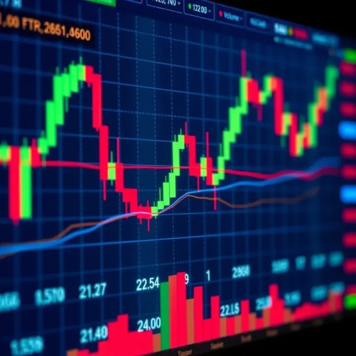
📈 Discover how to read trading charts, spot patterns, and use indicators effectively. Boost your trading skills with tips tailored for Pakistan's market.
📱 Discover how to use trade apps efficiently in Pakistan! Learn about types, benefits, key features, security tips, and market-specific advice. 💡
Based on 5 reviews